A clean-label nut butter brand taken from logo to retail shelf – identity, three SKUs of compliance-ready label artwork, a launch content system and a direct-to-consumer storefront.
ClientRiche Foods, Bengaluru
SectorD2C food – nut butters
ServicesBrand identity, packaging & print, social campaign, website
Riche Foods had the hard part solved – genuinely clean-label nut butters with one ingredient, no palm oil, no added sugar. What they didn’t have was a way to prove any of that in the two seconds a shopper spends looking at a shelf.
The category is crowded and loud. Every competitor claims “natural” and “healthy” in the same generic green-and-brown palette, which means the claims cancel each other out. A brand entering that shelf needs a specific, defensible thing to say – and it needs to survive being printed on a curved 200g jar.
The approach
Lead with the number, not the adjective.
Instead of another “100% natural” badge, the packaging leads with the one thing competitors can’t copy without changing their recipe: protein content, stated per SKU.
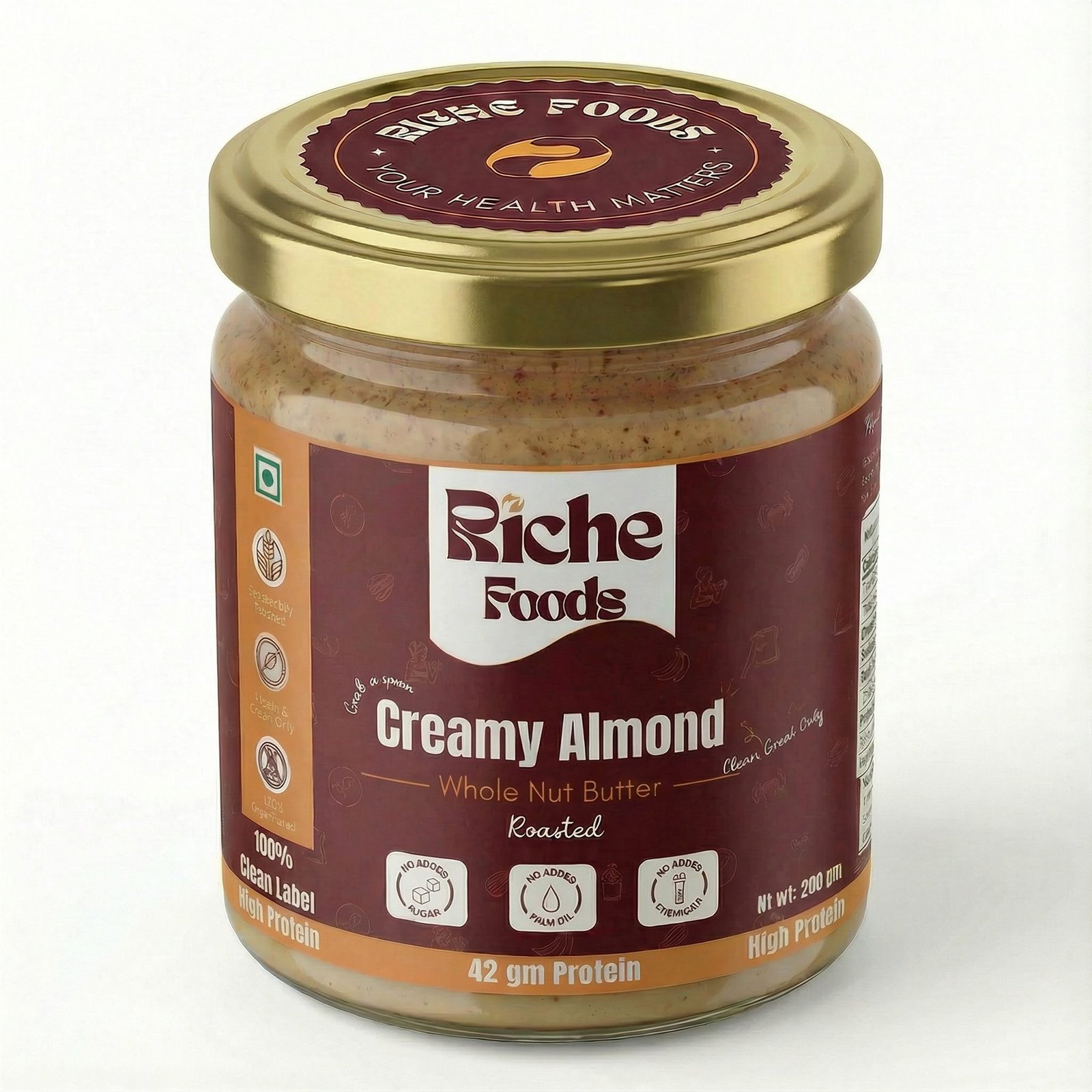
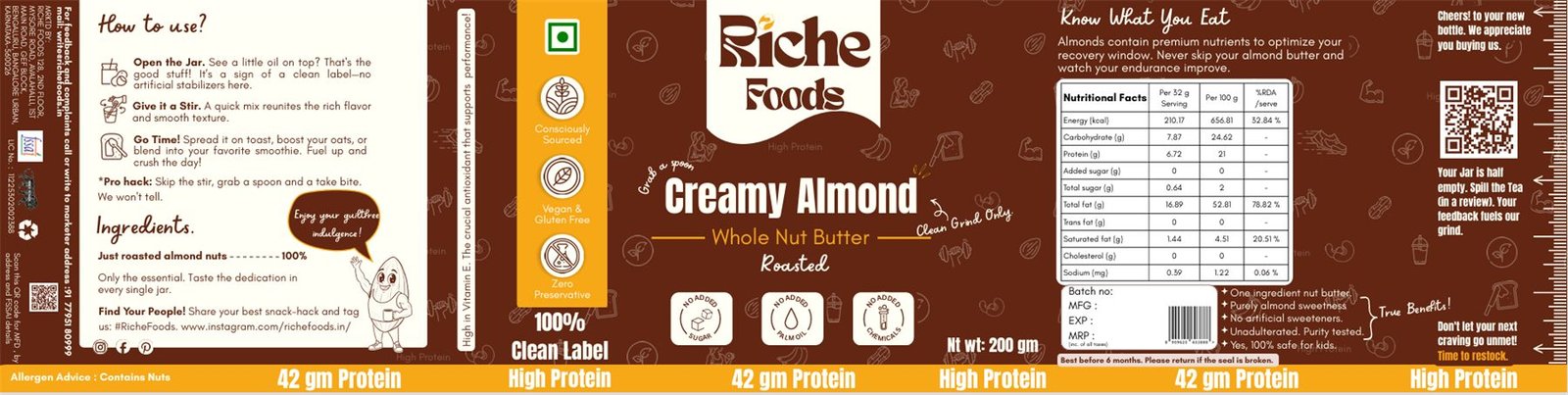
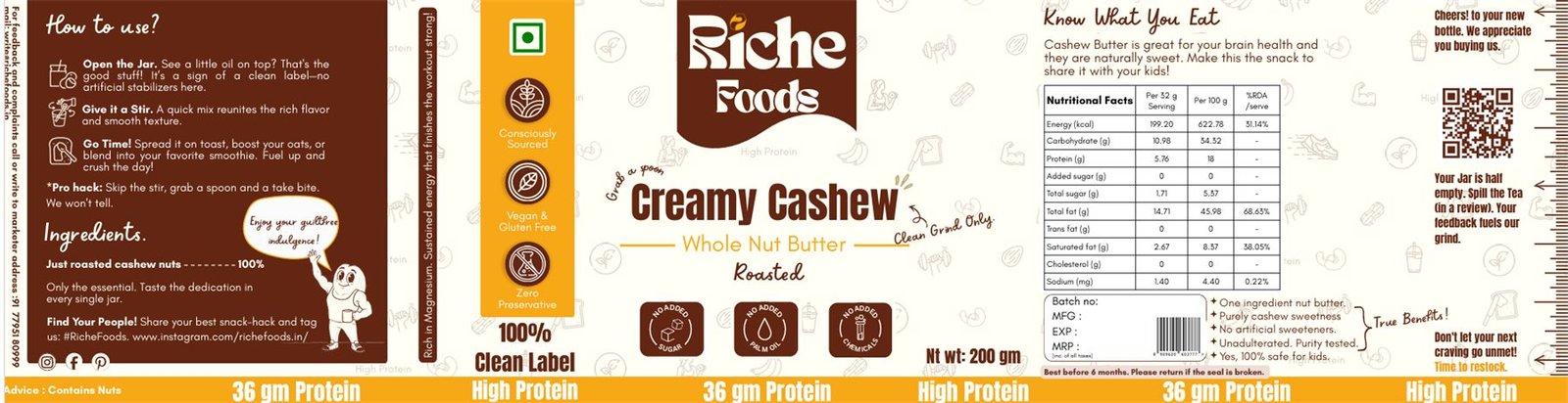
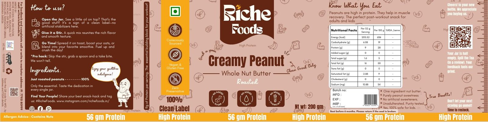
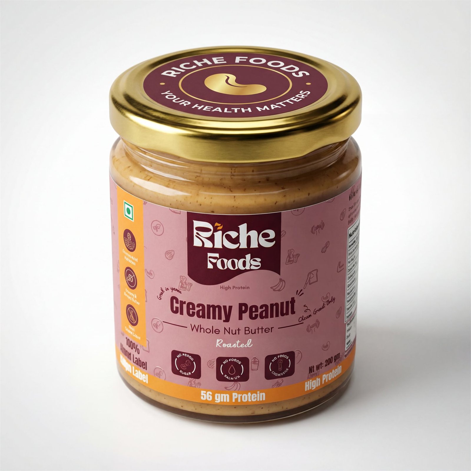
42g for almond. 36g for cashew. 56g for peanut. Set in the largest type on the pack, repeated around the base band so it reads from any angle on shelf. The claims that matter legally – vegan, gluten-free, zero preservative – sit in a consistent icon column so a returning customer finds them in the same place every time.
Packaging system
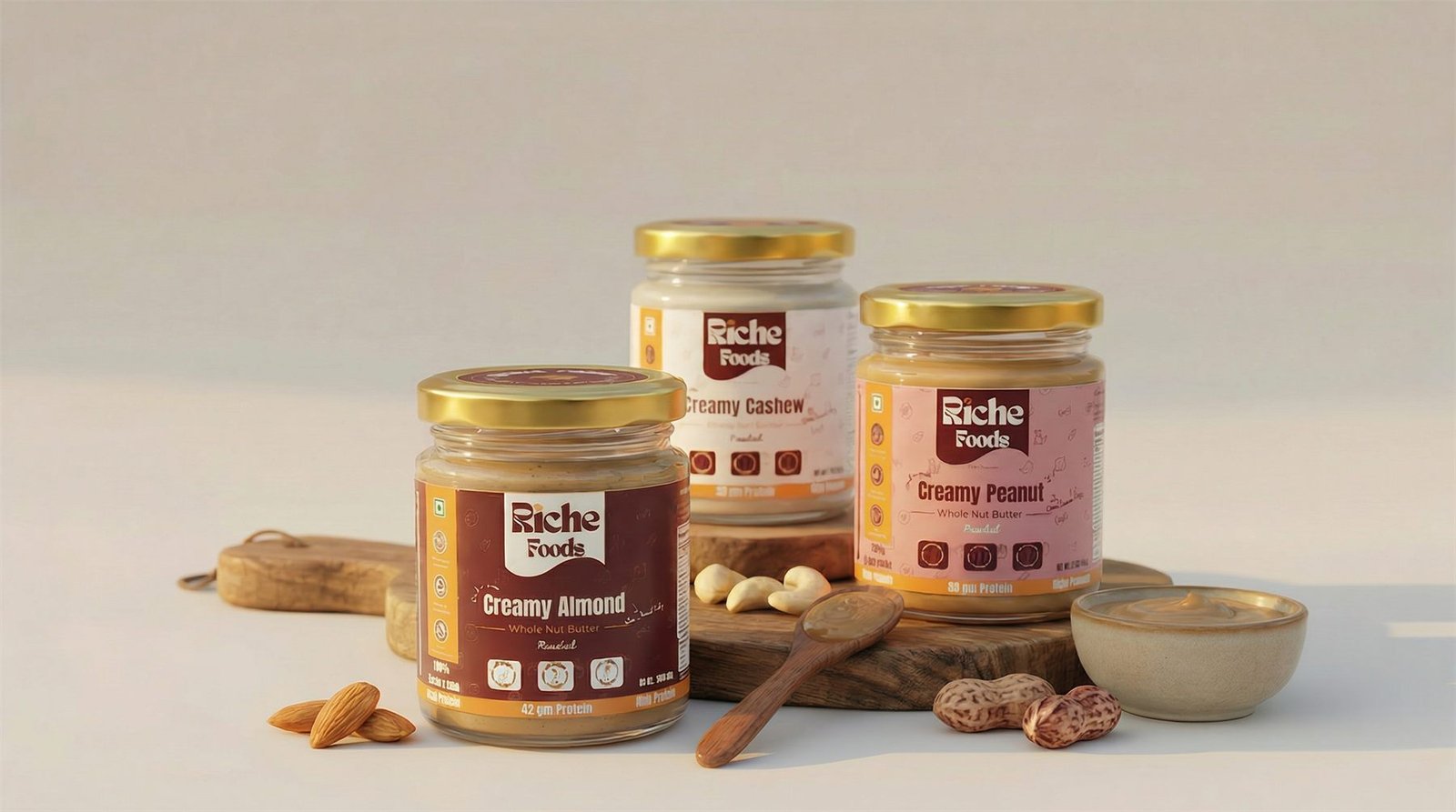
Nut butter packaging design: three SKUs, one grammar.
Each flavour gets its own colourway so the range is scannable on a shelf, but the architecture never moves – logo block, product name, protein band, icon column, nutrition panel and statutory marks all sit in fixed positions. Adding a fourth flavour later is a colour change, not a redesign.
Creamy Almond – 42g protein. Deep maroon with amber accents.
Creamy Cashew – 36g protein. Warm cream ground to separate it on shelf.
Creamy Peanut – 56g protein. Blush ground, the highest-protein SKU in the range.
What’s actually on the label
Retail food packaging in India is a compliance document before it’s a design. Every one of these went out with:
Nutritional facts panel – per serving and per 100g, with %RDA
FSSAI licence number and the vegetarian mark
Ingredient declaration and allergen advice
Net weight, batch, MFG, EXP and MRP fields
Scannable barcode and a QR to the brand’s Instagram
Marketer address and consumer complaint contact
The bits that make people keep the jar
Compliance gets a product on the shelf. Personality gets it photographed and reordered.
A hand-drawn nut mascot appears on every SKU with a speech bubble. The back panel talks like a person – “Open the jar. See a little oil on top? That’s the good stuff” – and there’s a pro-hack line rewarding anyone who reads that far. The right edge asks for a review in the same voice: “Your jar is half empty. Spill the tea.”
None of that costs anything to print. All of it is why a shopper picks this jar over the identical-looking one beside it.
Identity
A wordmark built for a curved surface.
The Riche Foods mark had to work at 18mm on a jar lid and at full width across a website header, in a single colour and in full colour, on maroon and on cream.
The solution was a heavy custom-feel wordmark inside a torn-edge banner shape – the banner does the work of separating the logo from busy packaging patterns, so the mark never has to compete with the illustrated background it sits on. The lid seal reuses the same shape as a circular lockup with the brand promise set around it.
Logo variations – primary, reversed, seal and single-colour applications.
Launch campaign
Product first, always.
Food brands lose momentum when the feed drifts into quote cards and stock photography. The launch system was deliberately narrow: the jar, the texture, the protein number. Templates were handed over so the team could keep producing in the same language after launch week.
Product art direction for the launch shoot.
Campaign creative – the pack does the talking.
Storefront
The shelf, translated to a screen.
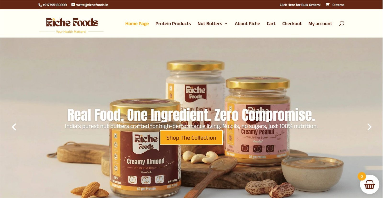
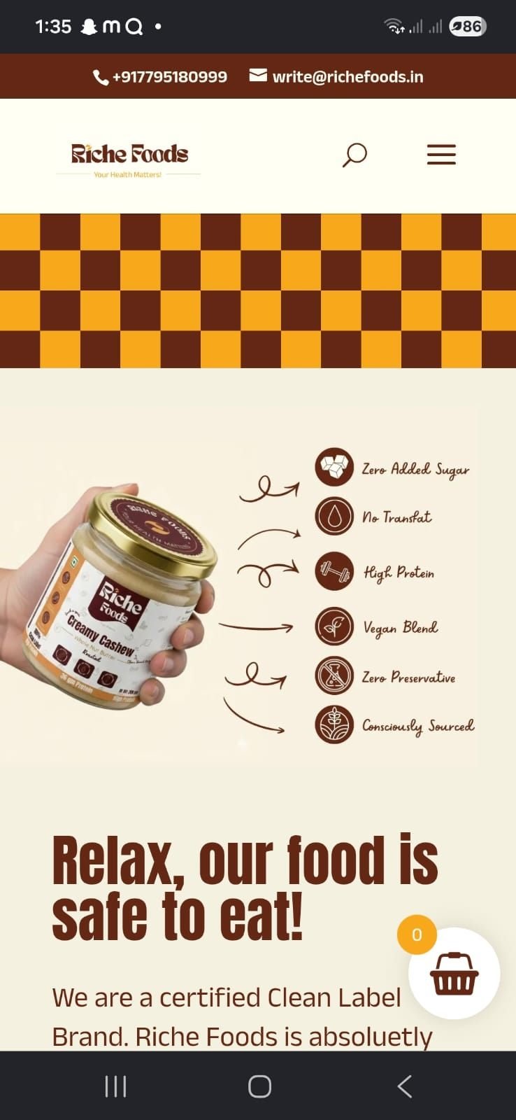
The website carries the packaging language directly – same maroon, same protein-forward hierarchy, same voice. Built mobile-first, because that’s where nearly all D2C food traffic in India actually lands.
Desktop storefront.
Mobile, where the traffic is.
The outcome
A brand that ships without me.
Three SKUs went to print from approved artwork without a rebuild. The label system takes a new flavour as a colour swap. The social templates are editable by the founders, and the storefront speaks the same language as the jar sitting in a customer’s kitchen.
That’s the whole point of one person holding identity, packaging, content and web at the same time: nothing needs translating between them, because nothing was ever separate.