A Bengaluru architecture and interiors firm with 25+ years of built work – and, until this project, almost no way for a prospective client to see any of it.
Edifice had the thing every young studio wishes it had – a quarter-century of completed projects and a reputation across Karnataka. What it didn’t have was anywhere to point a prospective client who asked to see the work.
Architecture is bought on evidence. A homeowner spending on a build wants to see finished rooms and read that other people trusted this firm and were right to. Word of mouth had carried the business a long way, but it stops at the edge of the network.
The approach
Put the history to work.
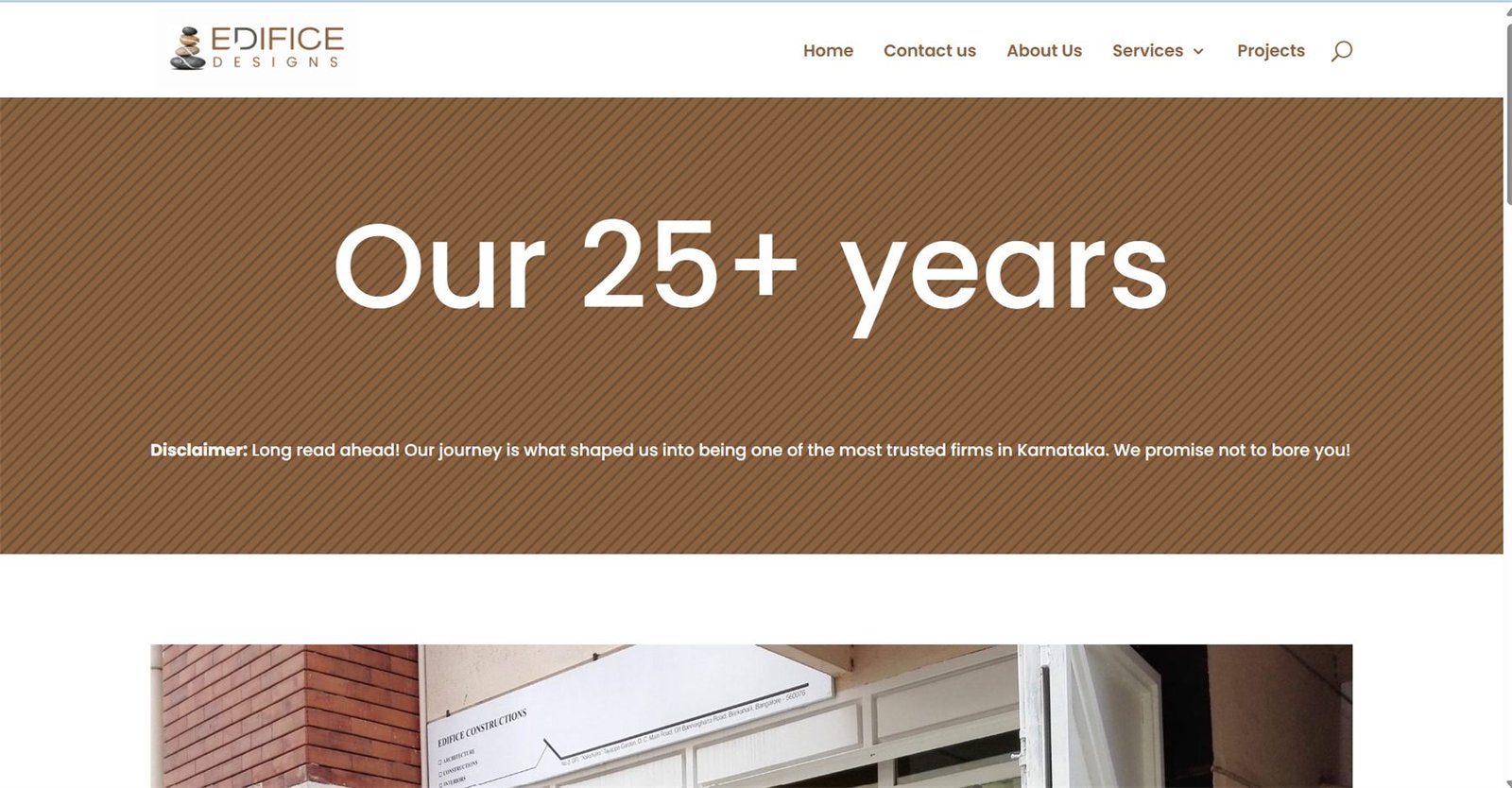
Rather than hide the firm’s age behind a startup-looking rebrand, the site leads with it. “Our 25+ years” runs as a full-width statement – the single most persuasive fact the business owns.
The tone was written to match how the firm actually talks. A line on the about page reads: “Disclaimer: Long read ahead! Our journey is what shaped us into being one of the most trusted firms in Karnataka. We promise not to bore you.” That warmth is a real differentiator in a category full of interchangeable corporate boilerplate.
Identity
Architecture firm logo design: balance, literally.
The mark is a stack of balanced stones inside a circular seal – a structure held in equilibrium, which is both what an architect does and a recognisable image of calm. It sidesteps the two clichés the category runs on: the abstract roofline and the generic blueprint grid.
Primary mark, reversed on dark.
Light-ground variation.
Alternate lockup.
Compact variation.
Applied across collateral.
Favicon-scale mark – legible at 16px.
Website
Structured around what a client asks.
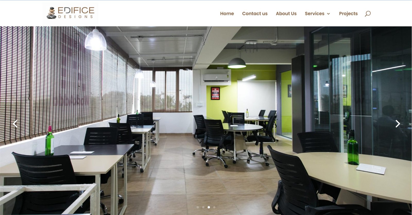
Five pages, ordered by the questions a homeowner actually has: can I trust you, what do you do, what have you built, and how do I reach you. The warm brown and stone palette is drawn from the materials the firm builds with.
About – the firm’s age as the headline, not a footnote.
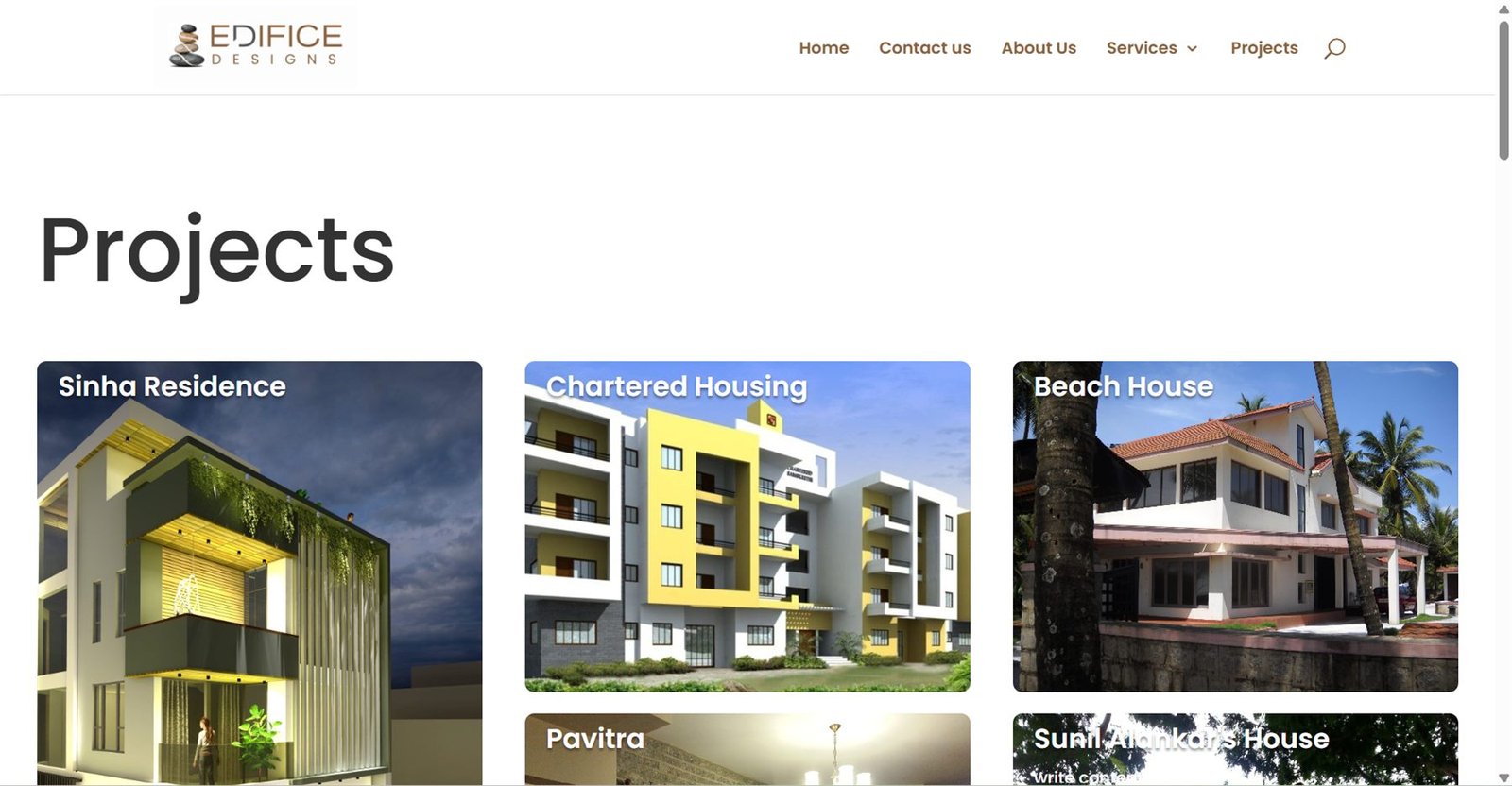
Projects – the evidence page the business never had.
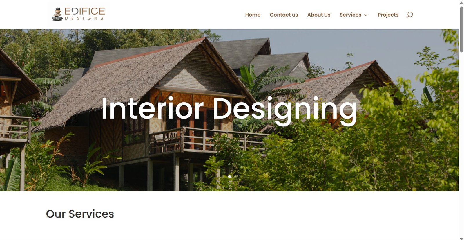
Services – architecture, construction, interiors.
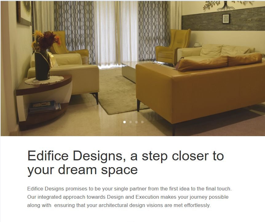
Section detail.
The outcome
Somewhere to send people.
The firm now has a mark that works from a site board down to a browser tab, and a website that answers a prospective client’s questions in the order they ask them – so twenty-five years of built work finally does some selling.